C R E A T I V E D I R E C T I O N
+ C A M P A I G N D E S I G N
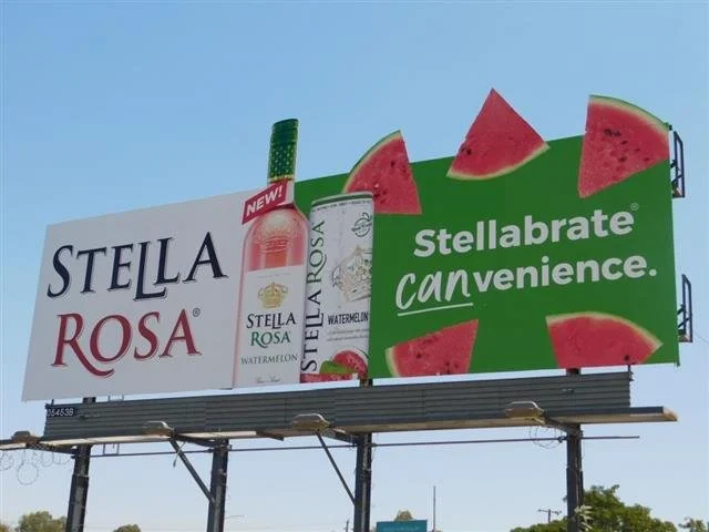
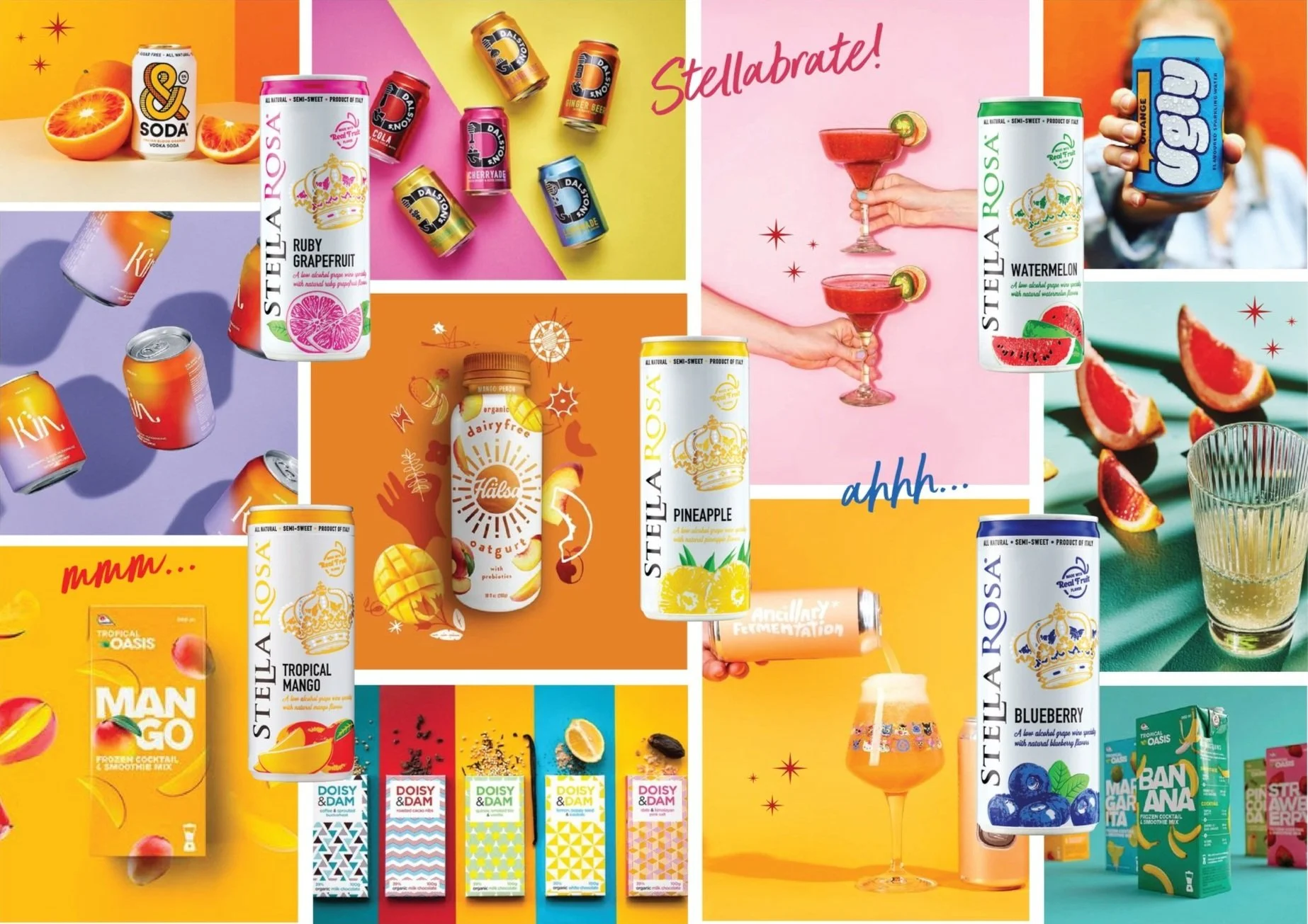
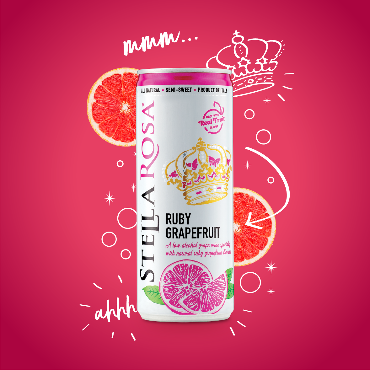
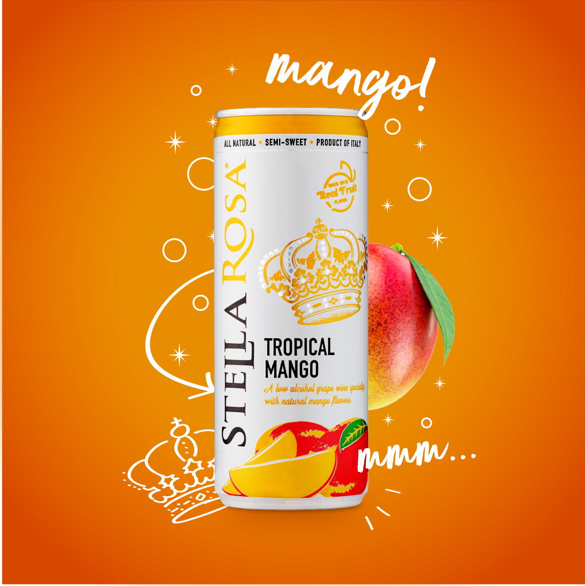
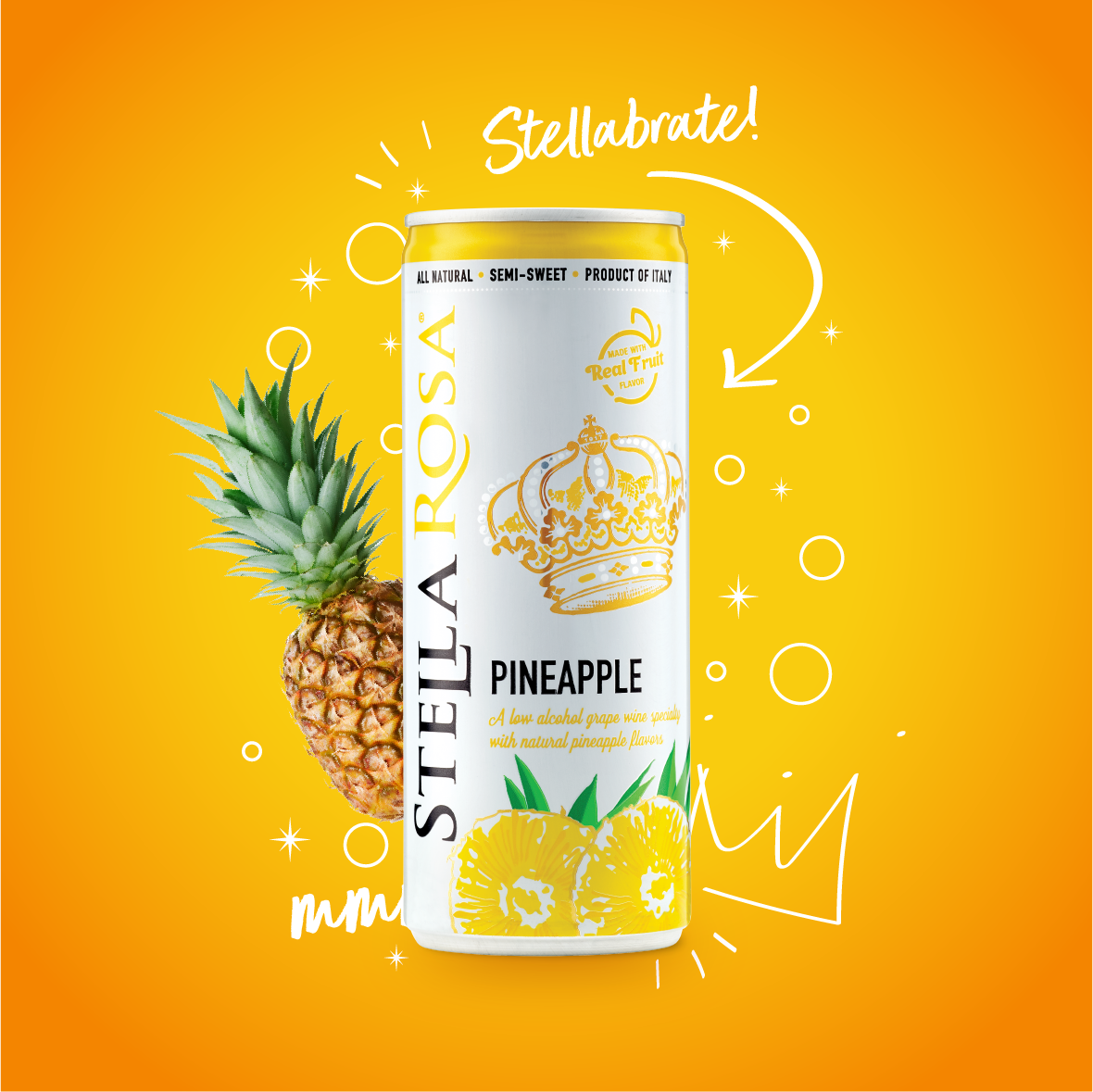
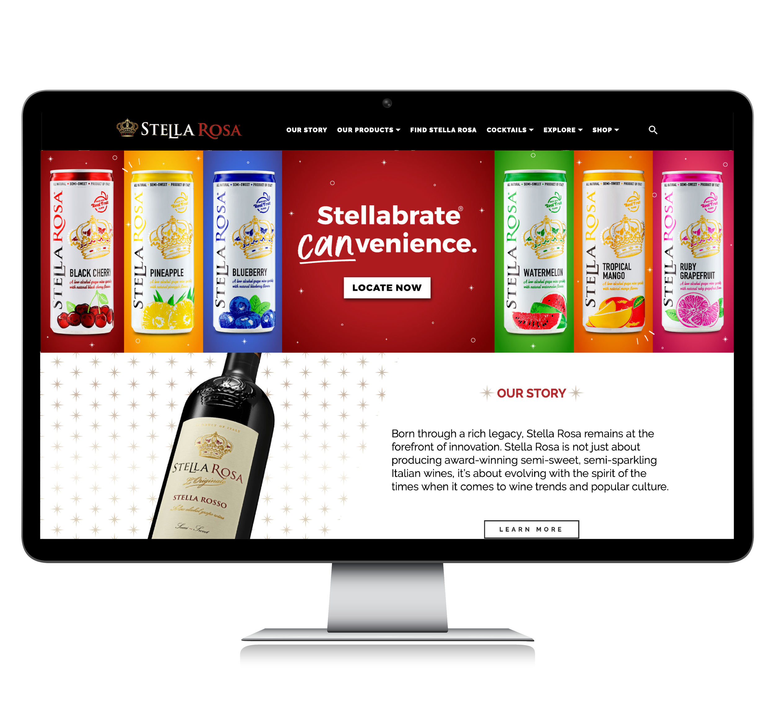
S T E L L A B R A T E
C A N V E N I E N C E
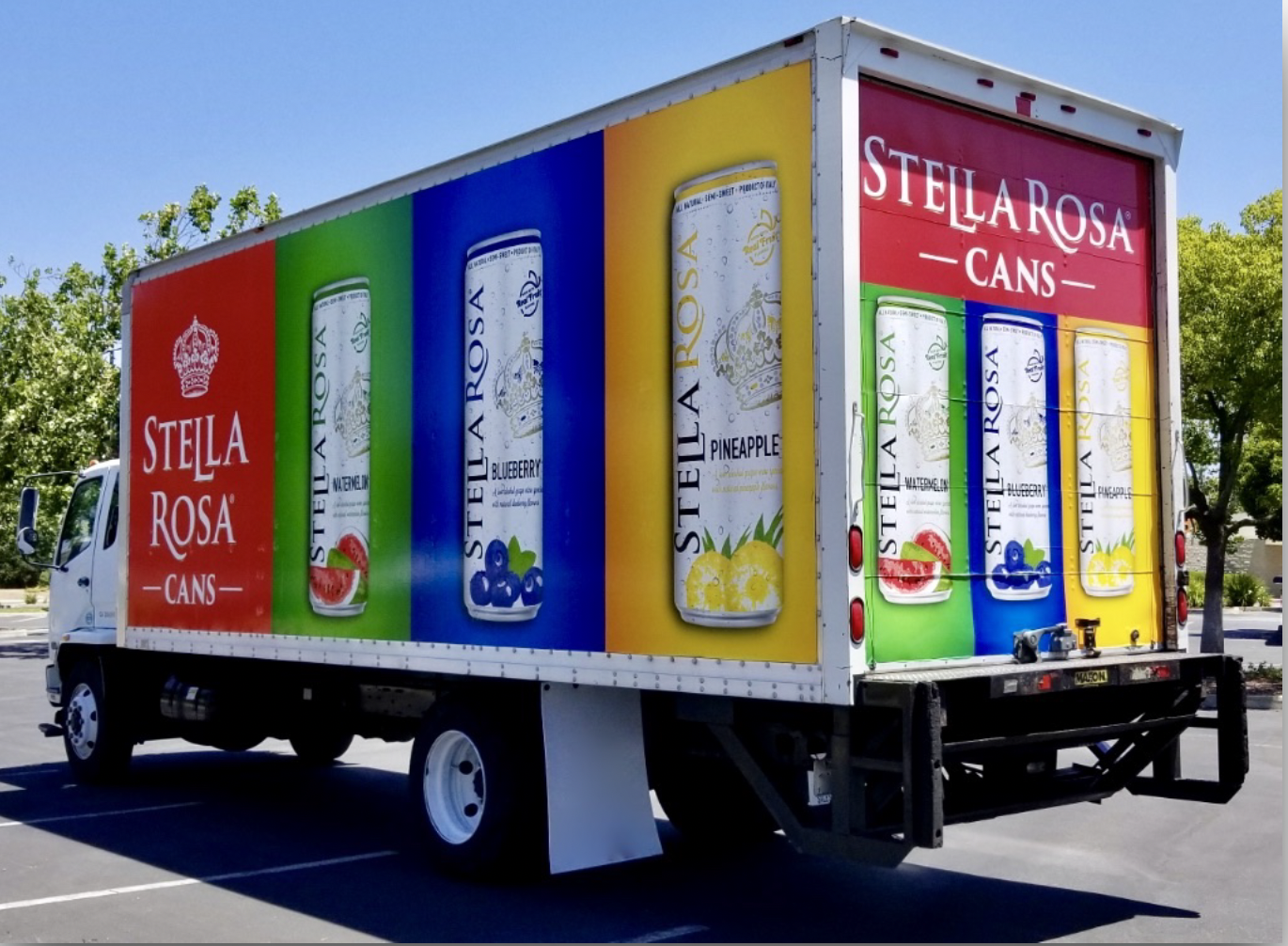
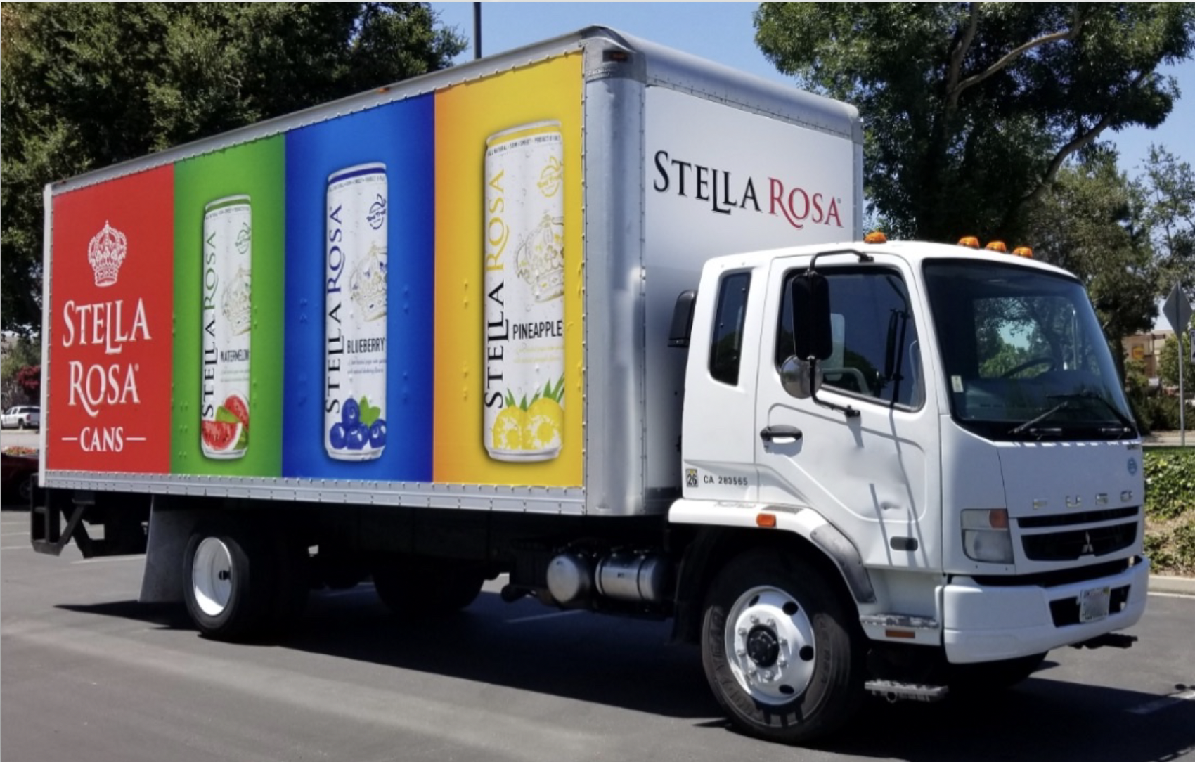
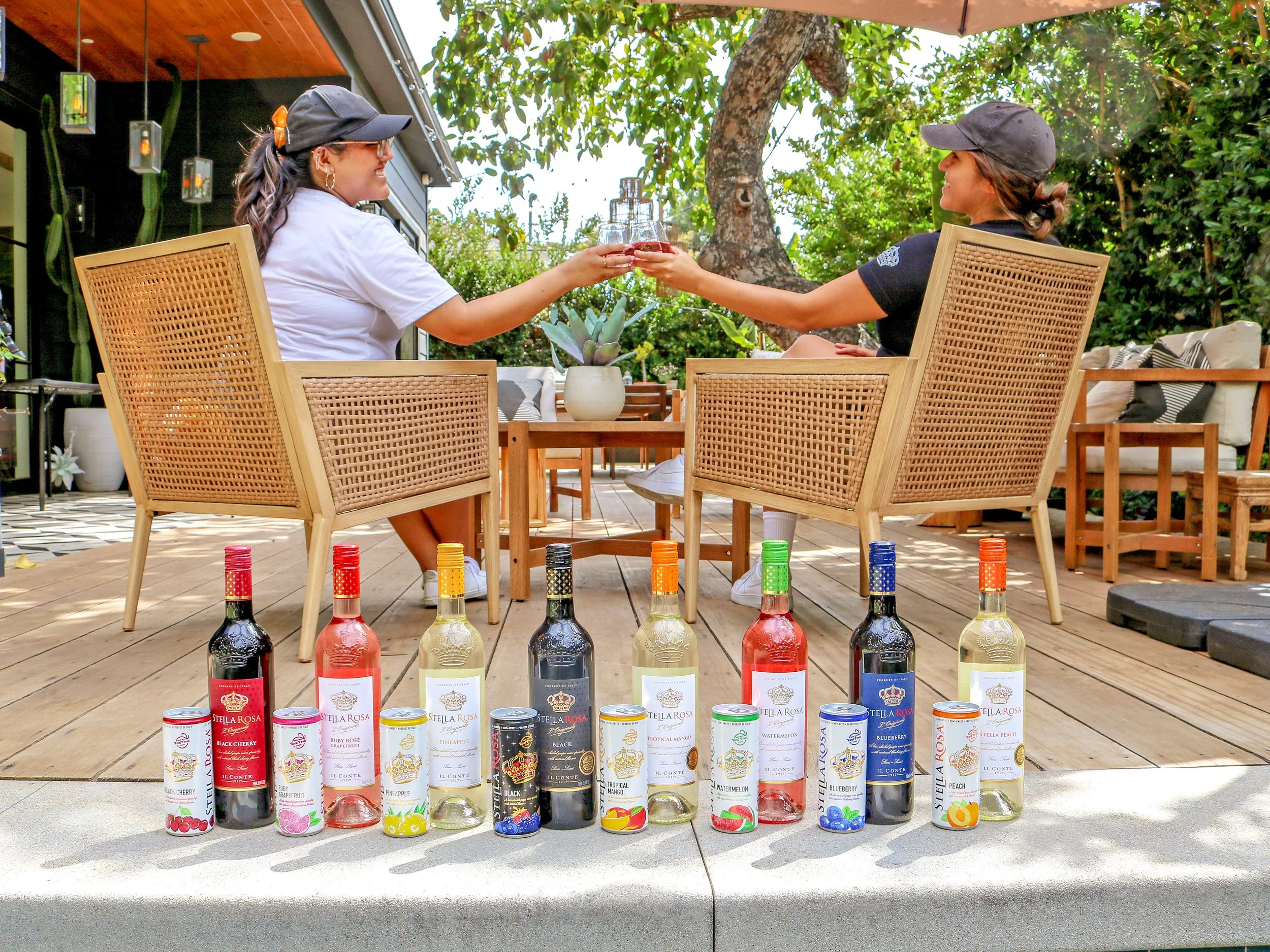
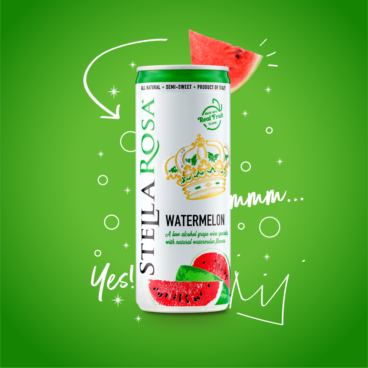
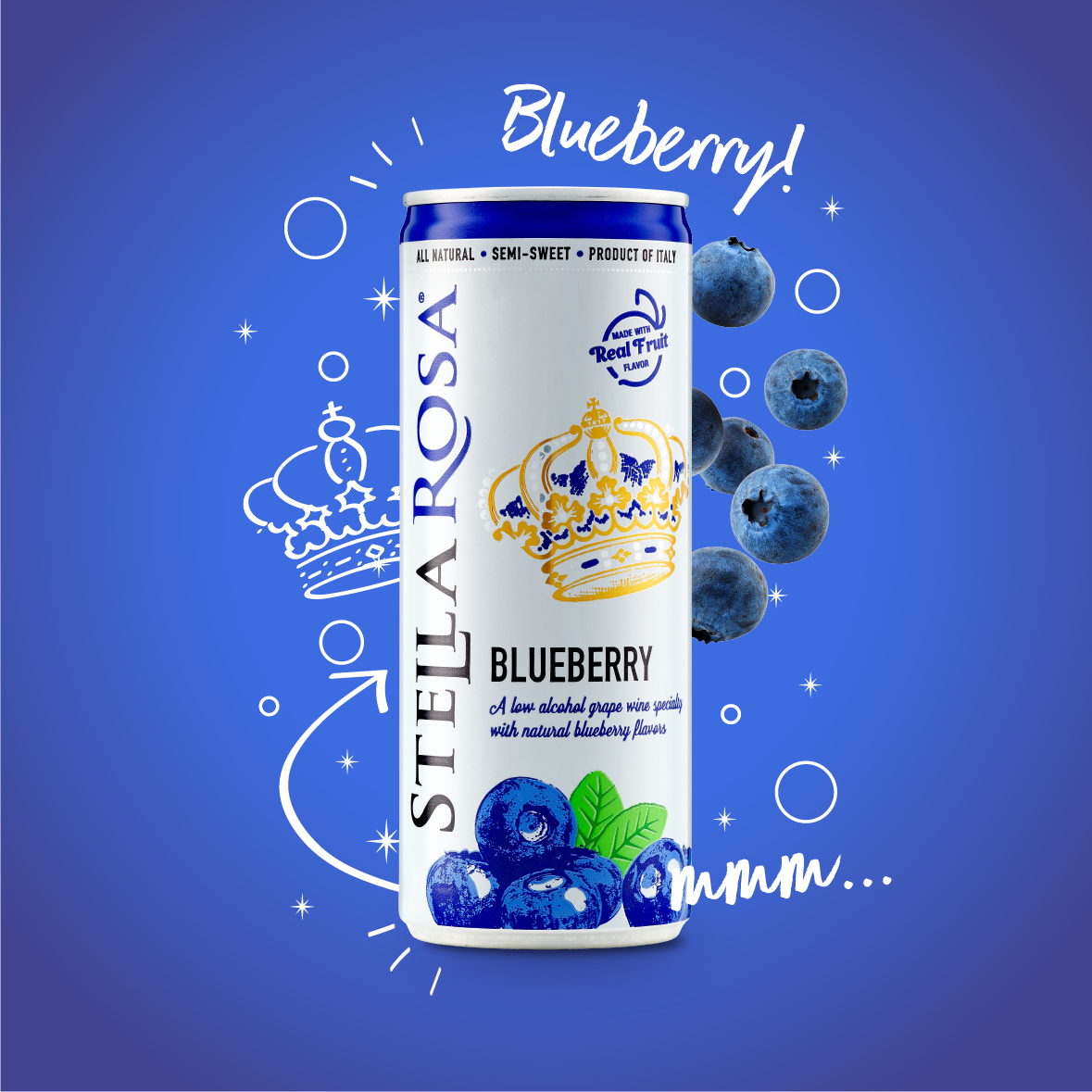
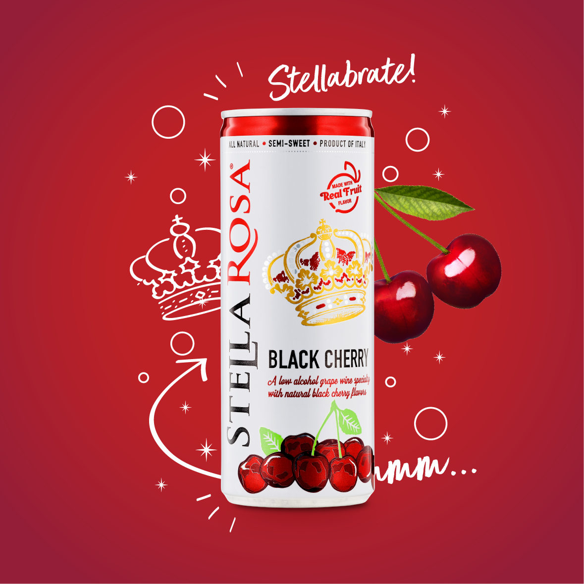
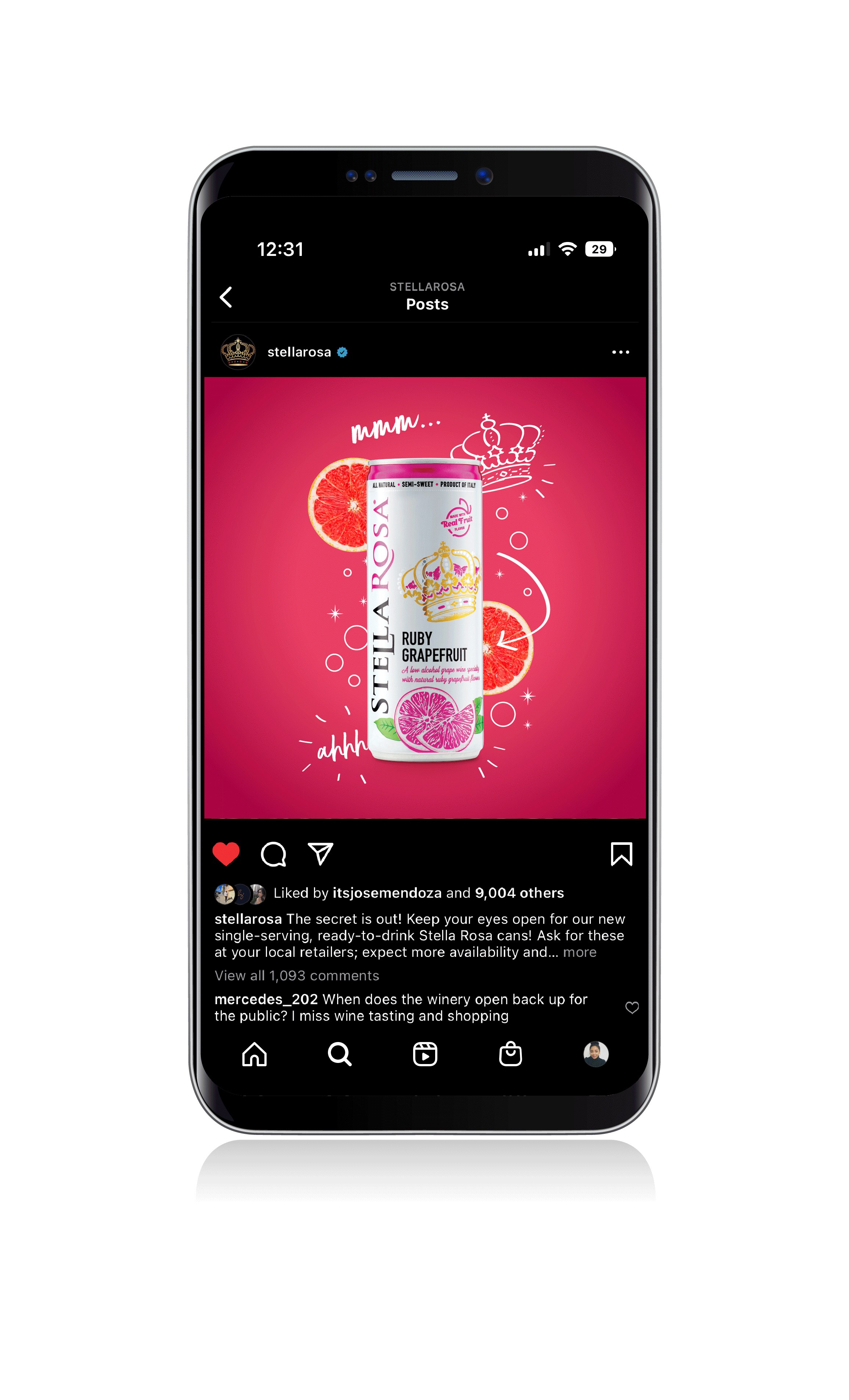
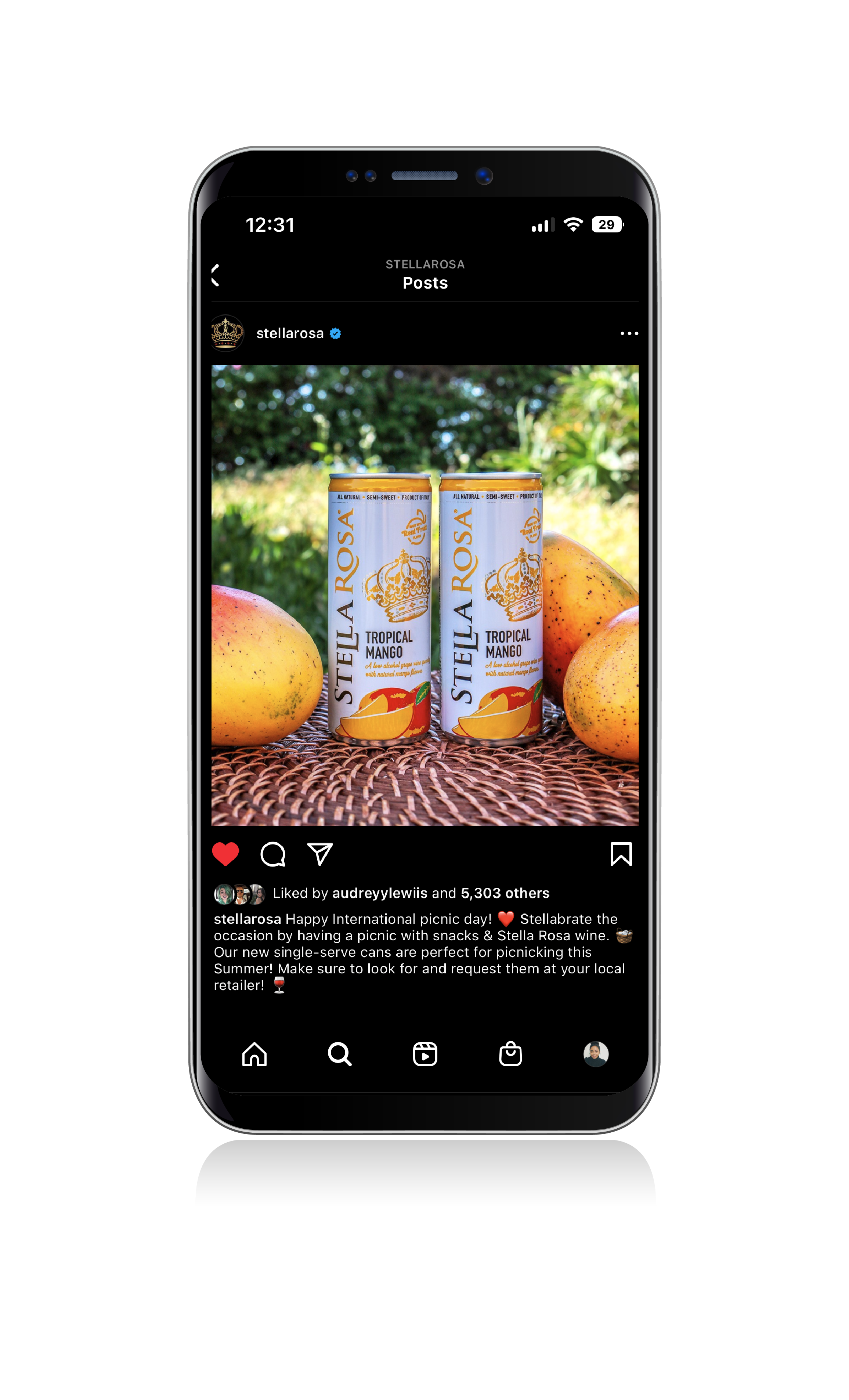
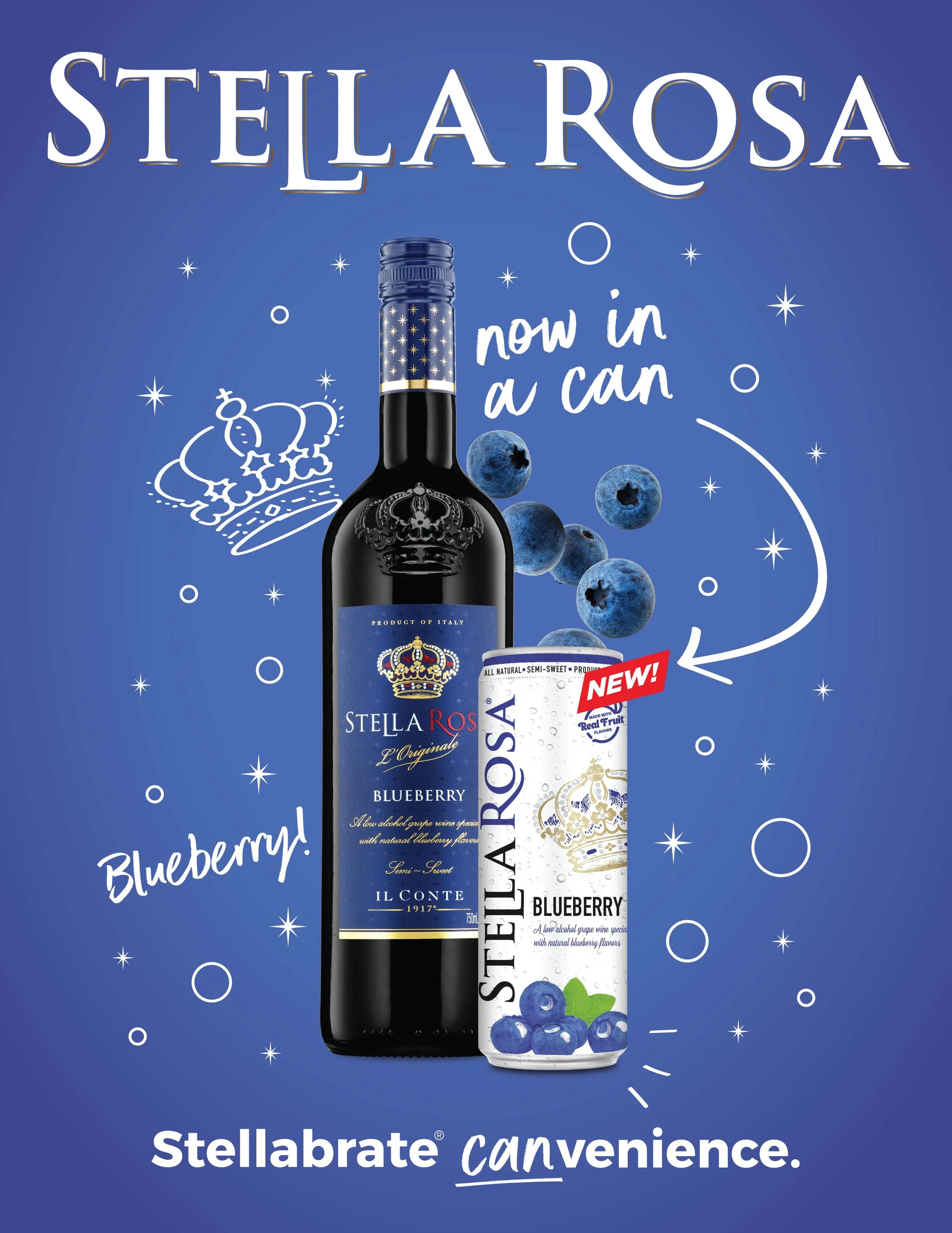
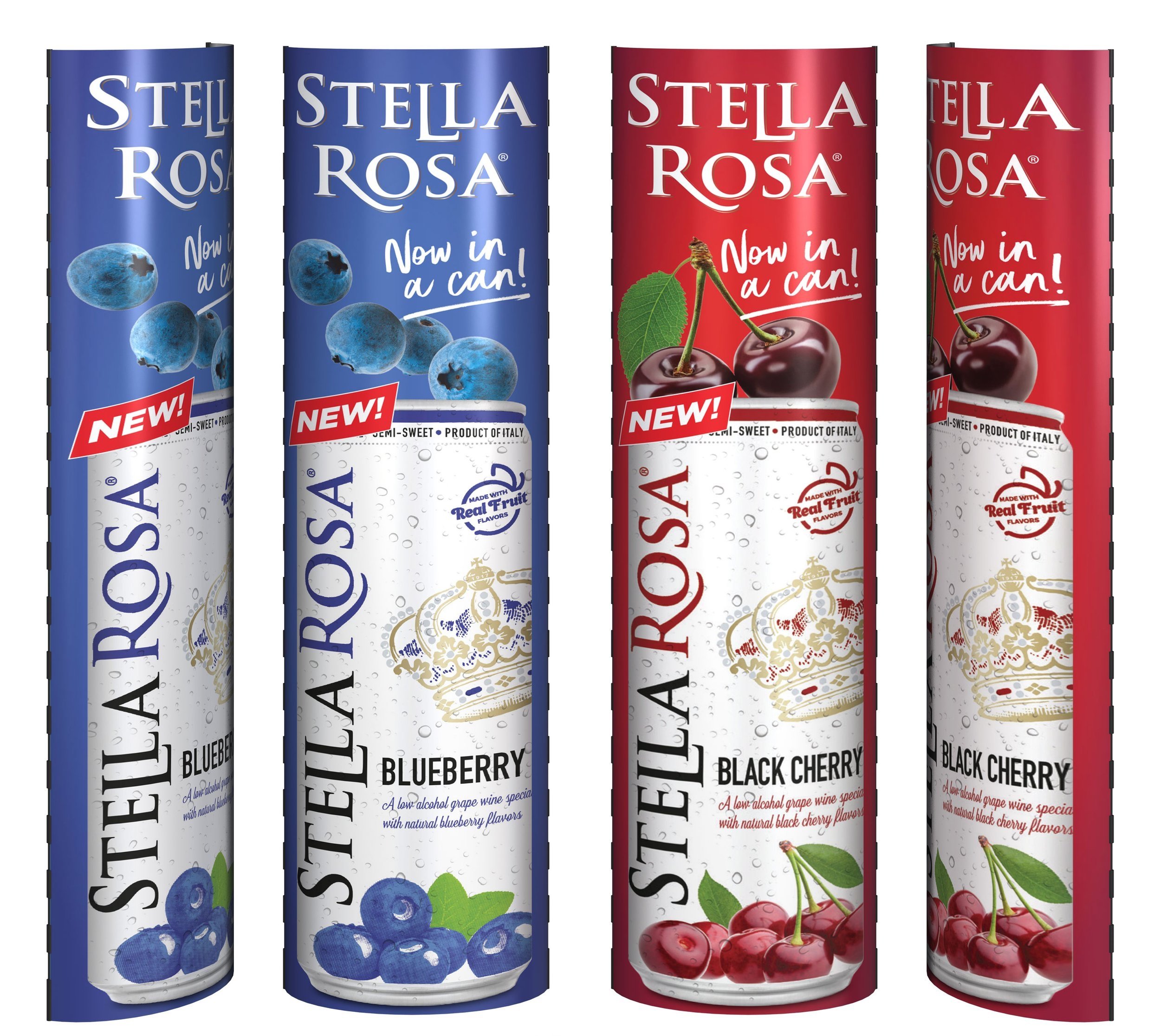
Stella Rosa takes the fun further and expands into the canned wine category. From concept to completion, we came up with the entire 360 Marketing plan, with myself as the lead designer. It’s all about the bright, bold, and fun essence of what Stella Rosa already is but now on-the-go, and with some extra canvenience.
A P P R O A C H
With the debut of only five core flavors, it was essential to make this campaign stand out from the rest of the traditional collection with a unique graphic approach. Color was a big aspect of this campaign and pulling from the pre-set packaging design was the basis of my color exploration. From there it was about bringing the subtle design elements such as layering gradients, small illustrations, and incorporating the Stella Rosa star language that tied it all together and brought depth and richness to the campaign as a whole.
M O O D
R E S U L T
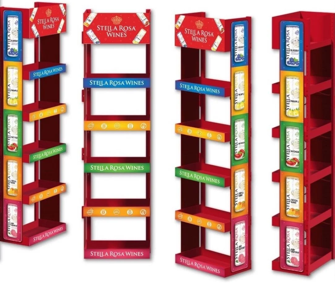
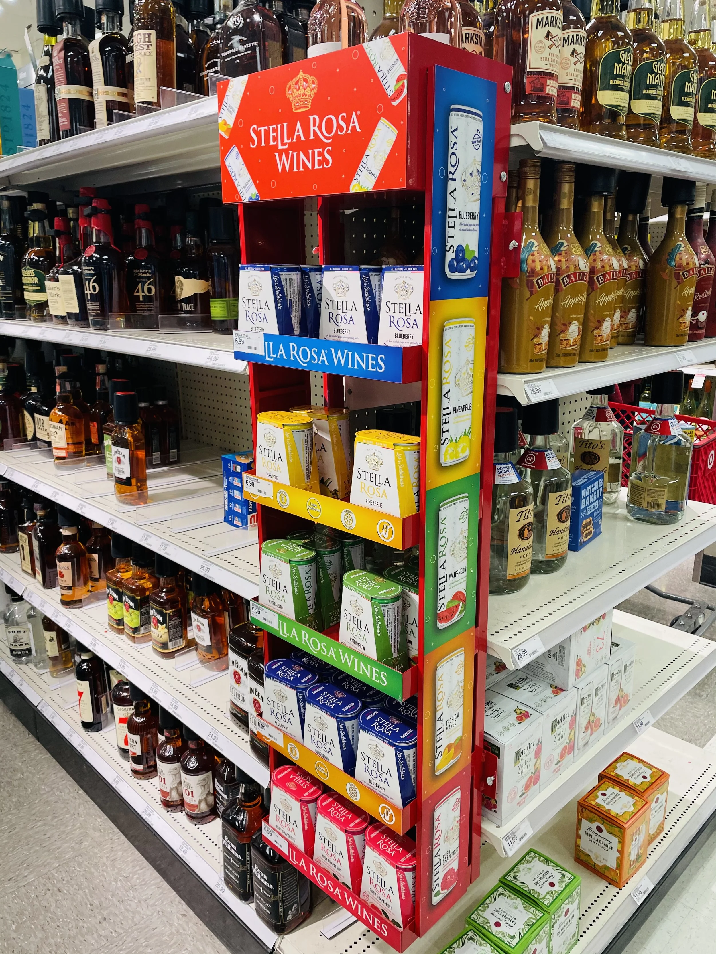
The response to this campaign was extremely positive as it bought a new wave of excitement for Stella Rosa drinkers. The point of sale items designed around this campaign stood out in aisles where there’s a lot of white labels, black bottles, and brown shelving. For that same reason is why this product still stands today and remains a successful summer campaign for the popular wine brand.
H E R O I M A G E S
D I G I T A L
D I G I T A L
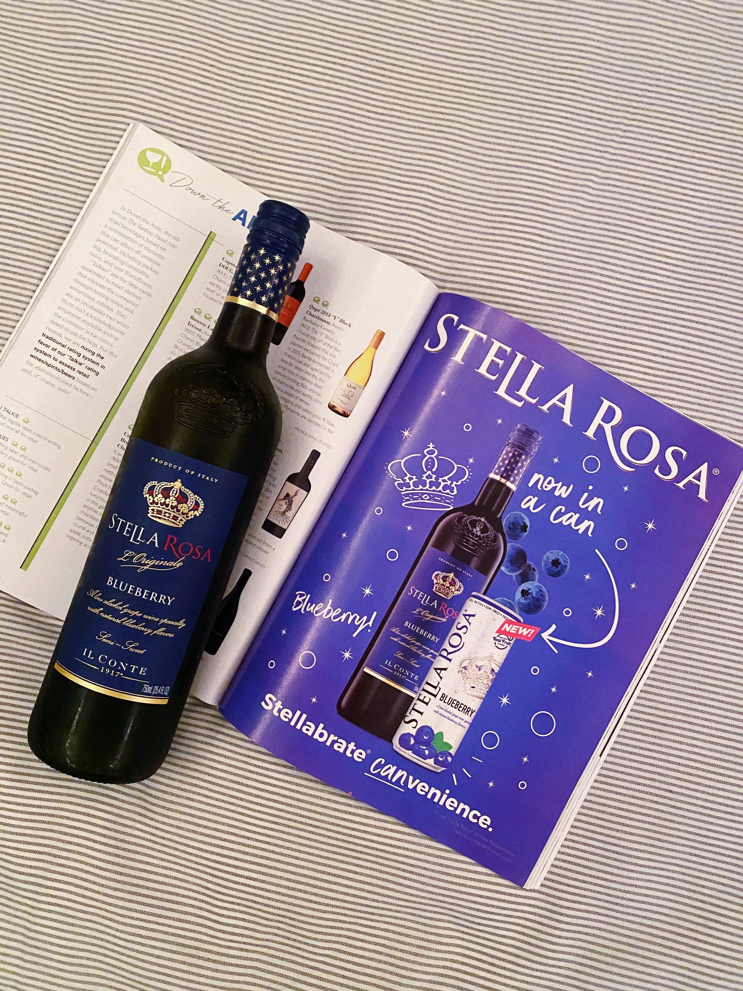
P R I N T
P O I N T O F S A L E
O U T O F H O M E A D V E R T I S I N G