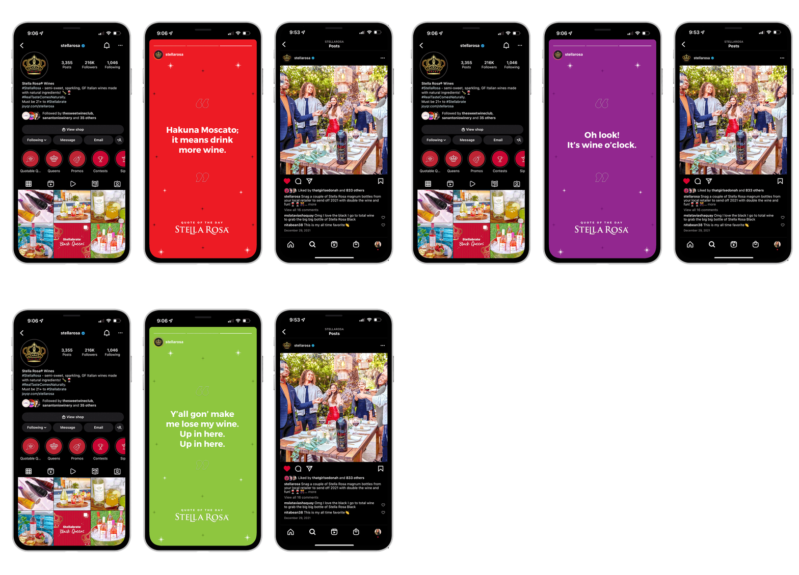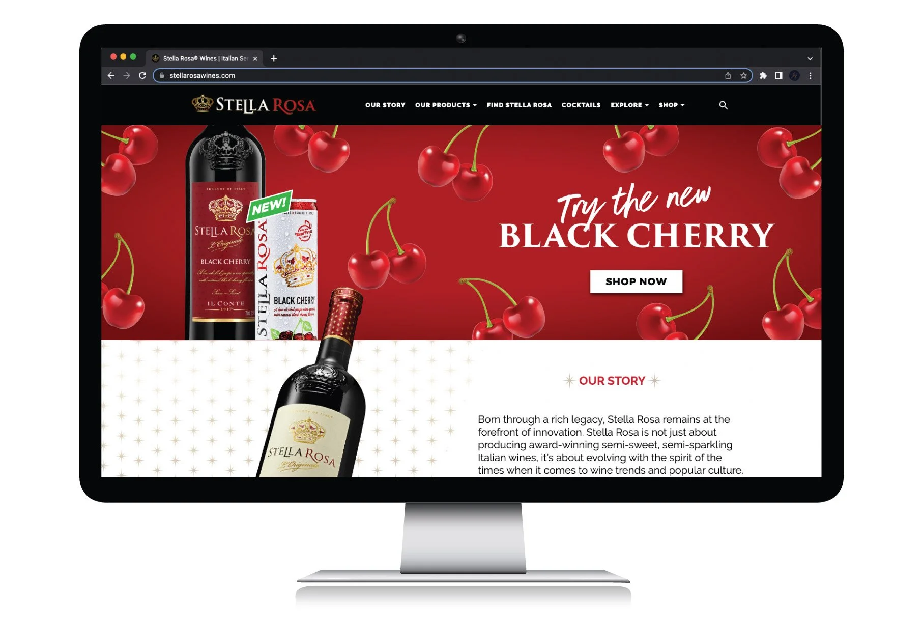
C R E A T I V E D I R E C T I O N + L O G O D E S I G N
S T E L L A ’ S B A C K
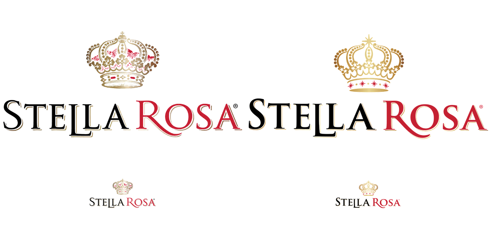
When you think of semi-sweet, semi-sparkling, fun flavored wine… you automatically go to Stella Rosa Wines. Established in 2014, Stella Rosa has grown to be the #1 Italian Imported wine and a proud staple in many homes. The approach going into the Stella Rosa refresh was to give the logo an overall face lift and blend its traditional Italian roots with a more modern approach. It was an important note to match the aesthetics to the brand’s playful personality that has come about through interactions between the product and its consumers.
T H E W H Y
1. Legibility
For a few years, there was always the hurdle of legibility of the brand when it came to printing on surfaces, creating print ads, and on event signage. It didn’t make enough of an impact and did not translate at a smaller scale.
2. Consistency
Different iterations and layouts of the logo were being used dependent on the content displayed or space alotted, which in turn, was creating a lack of consistent branding. So, with a concrete and solid refresh, quality control is more feasible along with a more organized outlet of what is consumer facing.
3. Stronger branding
Seeing as Stella Rosa was really gaining exponential growth and exposure, it was evident that the visual facade needed to do the same. The look, feel, voice, and creative needed to live up to this new potential as well as give enough visual credibility to move forward and gain even more success for years to come.
B E F O R E
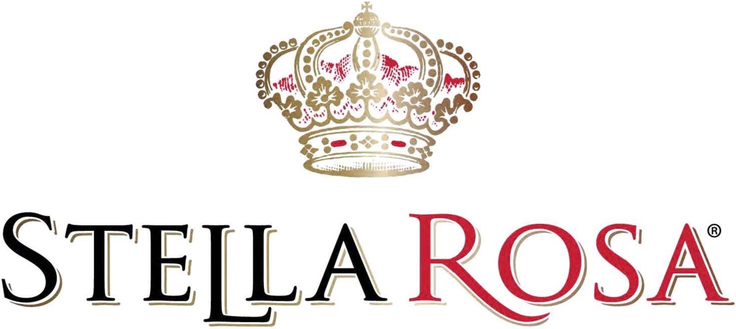
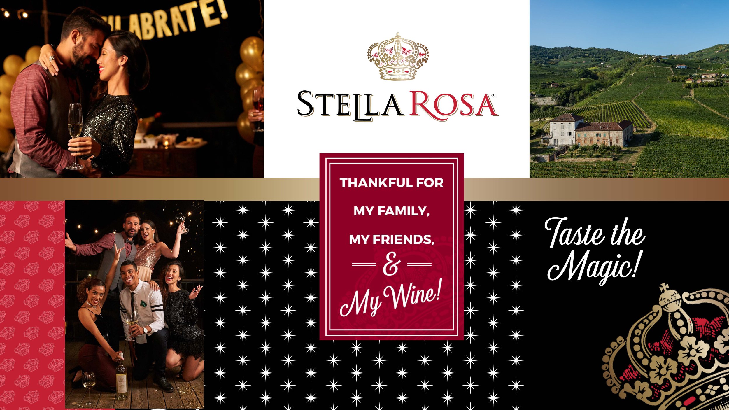
G O I N G I N T O T H E A F T E R
I took a step back and analyzed all the creative assets and logo iterations stemming from years past all the way to present. I believe that was a pivotal part in moving forward to an evolved concept. From there, it was about breaking down what can continue paving the way for the brand integrity and stripping down to the details that truly communicate louder and serve a more memorable purpose.
A F T E R
M O O D

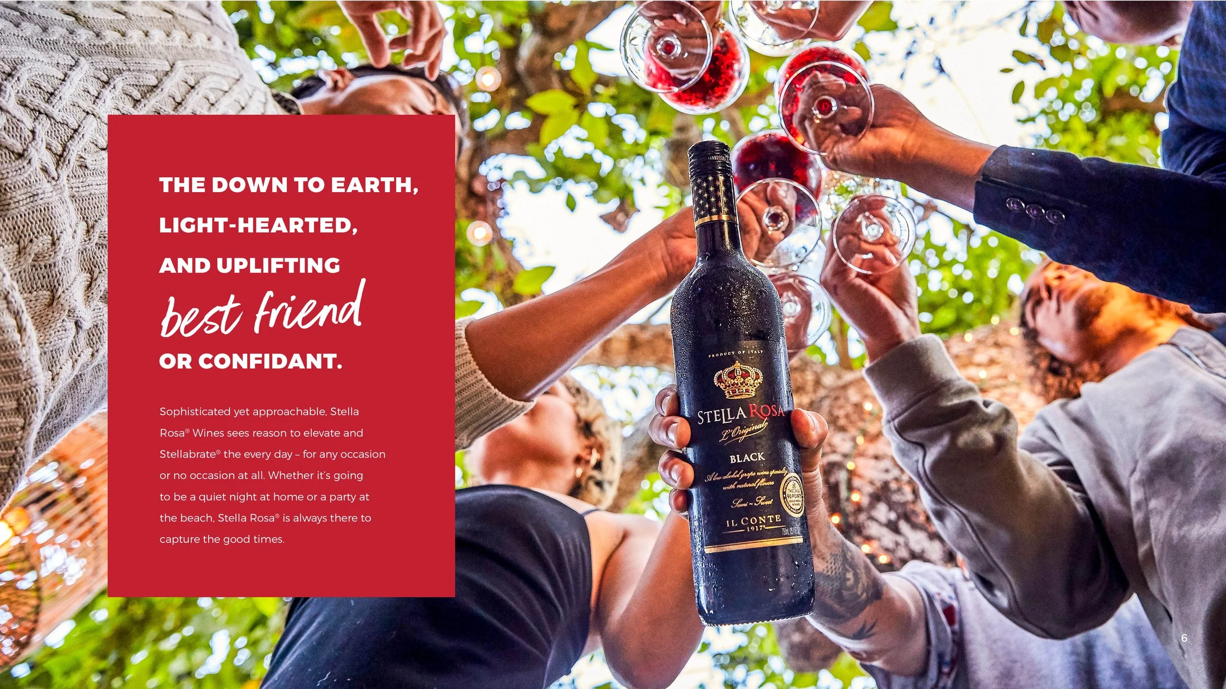
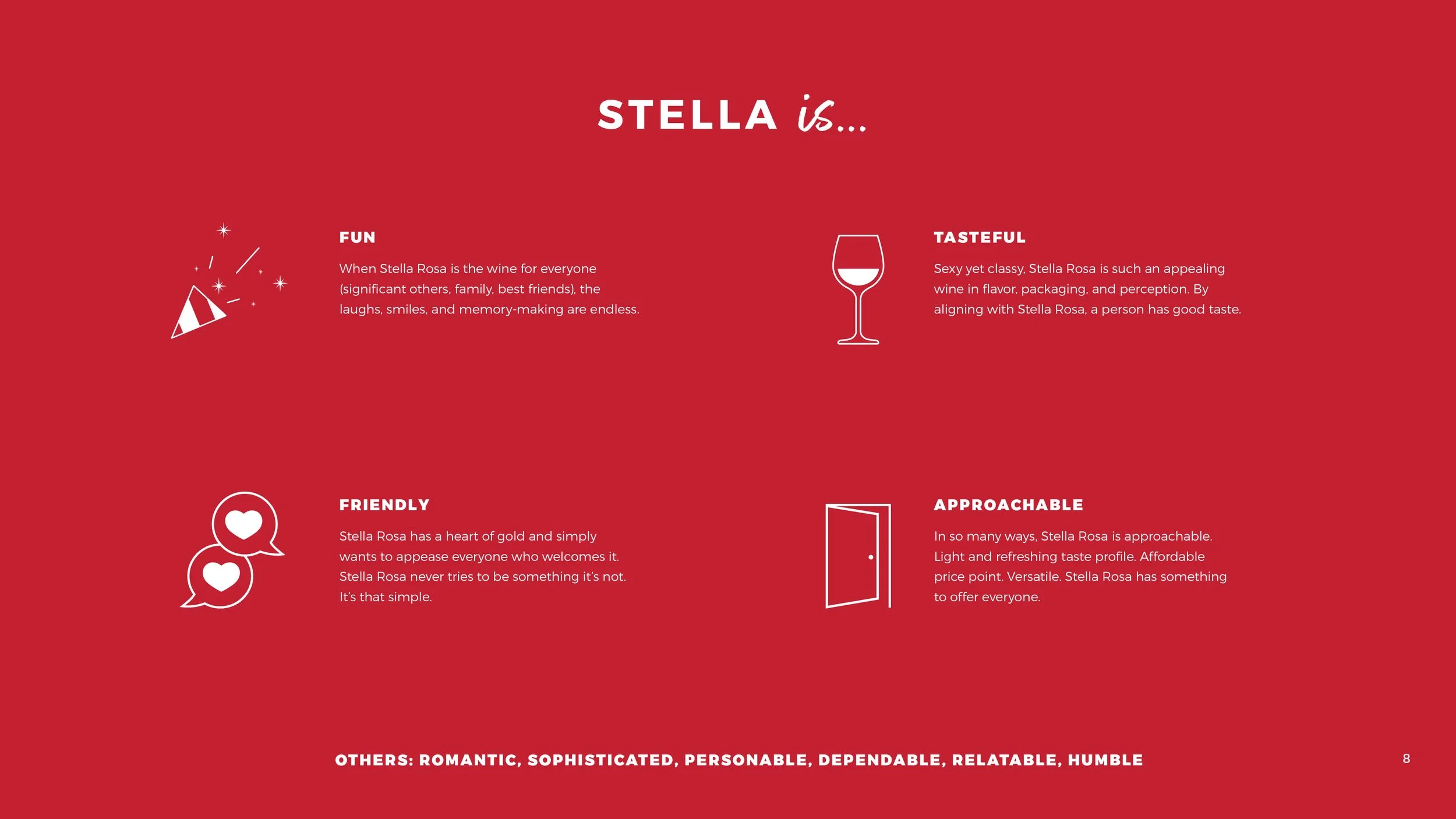
S T Y L E G U I D E




C R O W N A N D C O L O R


L O G O C O M P A R I S O N
R E S P O N S I V E L O G O S
“
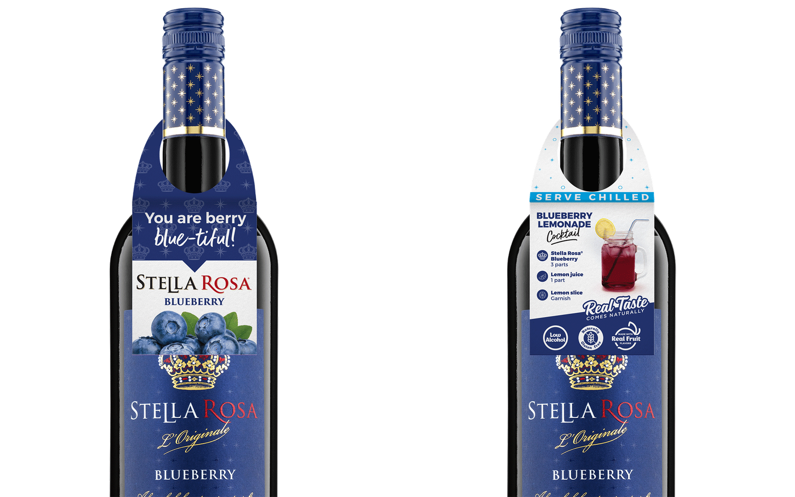
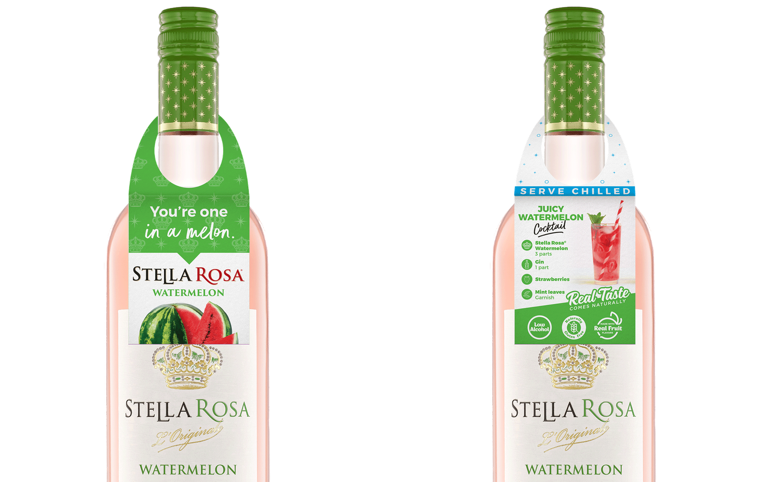
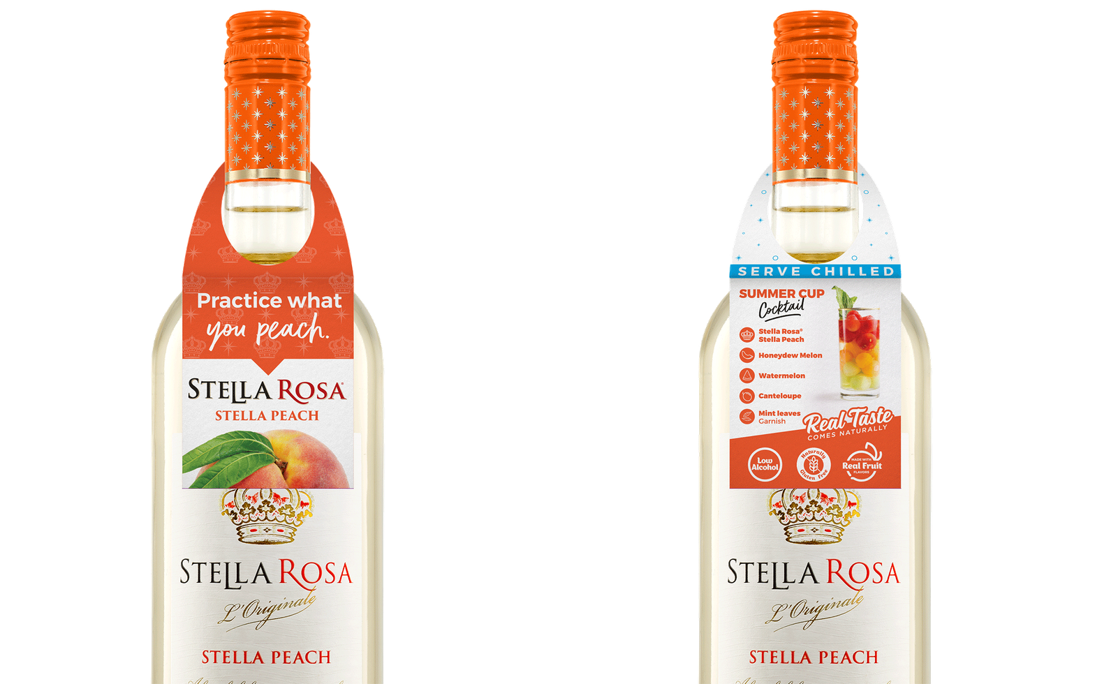
This has helped solidify a lot of the fantastic and consistent design work across multiple mediums, from billboards in Chicago to mass display pieces in-store at Walmarts nationwide.
– Kirk Dorman, Sr. Marketing Director
Stella Rosa Wines
P O I N T O F S A L E
D I G I T A L
M E R C H A N D I S E


